Wix
So you have been living in your current place for some time, and you are now ready for the next step! Your family is growing so you need to upsize, or maybe you are looking for a small condo after living in a large house for years, maybe you are moving to a new city, or maybe it's just time for a change. Whatever your reason is, you are now thinking about taking the next step and listing your place!
If you are already working with a good realtor, you are probably already aware of the mistakes to avoid when selling your home from an interior design point of view. Realtors normally have plenty of experience and know exactly what buyers are looking at (yes, the good and the bad things). But, if you are lacking some professional advice, then we will share a few pro tips with you today! We will go over some of the most popular mistakes sellers oversee and can make potential buyers walk away. Let's start!
Mediocre DIYs
Home Addict Anikas DIY Life
Many people decide to save some money and do things themselves, we get it, but when some key things are not done properly, then that money you saved can be a costly mistake! Flooring and painting are the two most popular DIYs seen in homes and you can easily tell when done in a rush. We often see paint brushing all over walls, ceilings, and even millwork. When people skip the painter’s tape, the primer, or a much-needed extra coating, it is very evident and it doesn’t look good at all! Same with flooring transitions and cuts around toilets and door frames. We suggest hiring a professional for these types of jobs, it will pay off and will save you from having potential buyers walk away because of a poor job.
Choppy finishes that are not cohesive
Wix Pinterest
When an older house has been through multiple renovations in its lifetime, changes in finishes were most likely done per room or in stages over the years. We often see different flooring colors and styles across the space, or the use of different tiling patterns or even hardware such as doorknobs and cabinetry pulls. This mismatch of different colours, materials, and styles are not cohesive and can limit your resale potential. We know it is hard to tackle renovations at all once but try to have a cohesive look and tackle the things that stand out the most before selling your place.
Pro tip: You can do the new owners a favour by leaving a sample or name and reference of your flooring, tiling, and paint colours in case they need to replace something in the future.
Removing your closet doors

Houzz
We have seen an increased removal of closet doors in listed homes. Honestly, it doesn’t look good to show your clutter. Displaying your closet clutter in a bedroom not only makes the space look messy but also is distracting and it comes across as a lack of storage options. Plus, you can use mirrored closet doors that help bounce light and create a more spacious feel!
Pro tip: The use of curtains can look better in an unfinished basement where you need to hide to storage or mechanical. Is cost-effective and it softens up the space a bit.
Create a livable space for anyone

If you have kids, pets or you practice any hobbies that require specific equipment or tools, then you probably have a designated area to play, work out or have fun with your crafts. We understand this is your and your family's lifestyle, but when you list your home, it is important for potential buyers to see themselves living there! During viewings, we recommend putting your equipment away, and creating a spacious layout that can work for anyone! If you have kids’ stuff all over your living room, move it to your kid's bedroom or open basement space for a few days. This will help people have a better idea of the potential of each room and define more specific uses for each area.
Avoid installing permanent décor or decorative millwork on walls
Wix
Sometimes you get creative and decide to add that beautiful reclaimed wood accent wall with shelving, or multiple colours as the backdrop for your bedroom, and even go with that custom-made ledge with faux brick... but remember that a specific design decision like this one is permanent and probably costly when trying to remove them. So, avoid adding permanent built-ins like these if you are not planning on staying for too long in your house, or at least do it in a way that is easy to remove in the future. This applies to slat walls, benches, niches, and custom-made trims or moulding to just mention a few. If you really want to bring some rustic or industrial features as an example, there are many other ways to bring them in without affecting the architecture and overall permanent look of your space.
Classic historic homes
Wix Love Property
If your home has 50+ years it probably has very unique architectural features that some people are really looking for such as a midcentury built-in, a classic stained glass, or perhaps a very unique 1800s stone fireplace. If these pieces are in decent condition and have shown to stand the passing of time in a good way, then highlight them! These can be key selling pieces for the right person.
Unfortunately, lots of historical elements like these have been modified over the years and now look like a mismatch of styles. If you have a heritage home and decide to make renovations always make sure the selection of your finishes and color scheme complements the existing historic elements. Nothing is worse than a home in which each room makes you feel like you are in a different decade!
Pro Tip: to combine different styles within the same room you can go for an eclectic look. This is a bolder choice and is not for everyone but it can look beautiful when done right! You can continue the style throughout the house but make sure there is some consistency.
Going overboard with themes
Wix Zolo
We love when people are very enthusiastic about their pets, hobbies, favorite sports, or really, any specific theme they feel passionate about, but as mentioned earlier, when selling your home, you want the space to feel relatable to anyone. We suggest avoiding having too much of the same decor theme in a room. We often see this with collectibles, memorabilia, and very specialized rooms such as catios (we love catios! but is a high space commitment not everyone is willing to take).
Non-functional bathroom updates
Wix
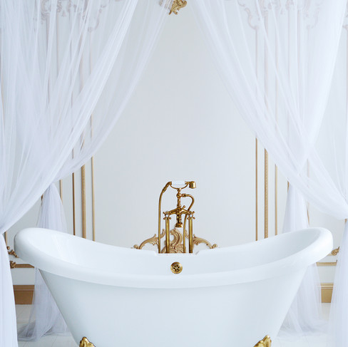
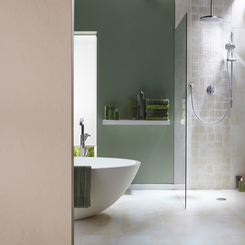
Last on our list is bathroom updates that don't make any sense. We know sometimes you see a nice idea on a fixer-upper TV show or maybe on a Pinterest board, but always keep functionality in mind. For example, we understand the look and feel of those beautiful stand-alone bathtubs and how they elevate the vibe of the bathroom, but houses normally have a combination of tub and shower or offer a secondary bathroom with a shower. Having just one trendy solution for bathing in the house is not for everyone and will only narrow down your potential market as buyers may see this as a very expensive change they will have to make. Same with double vanities. They look beautiful and are super functional, but if your bathroom doesn't have enough space and you are sacrificing the circulation area and functionality then this may not be the best solution.
The takeaway
Selling your home can be a fun process when done right! There is just so much that staging and accessorizing can do, but a home that is ready for sale entitles much more. When you are ready to start packing, check out our previous blog on Moving Like an Interior Designer, you'll find some valuable tips that will make your life so much easier!
Don't forget to always put yourself in the buyer's shoes and avoid making those mistakes that can make people walk away. Look for professional advice from a decorator, stager, or realtor and of course, you can always come to us! Having a house that is well designed can earn you a nice profit :)
Cheers!
White Dahlia Design Team


Comments